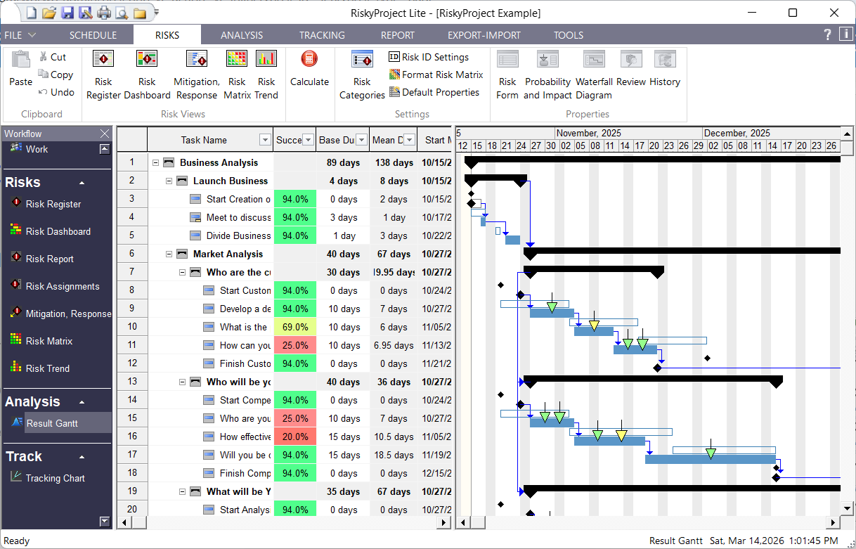
Risk Adjusted Project Schedule in RiskyProject Lite
The results of your project risk analysis are shown on the Results Gantt chart. You will see the ranges for start and finish times of each task, and be able to compare them with baseline or original project schedule. The RiskyProject scheduling engine is designed and optimized for risk analysis. Probabilistic calculations with multiple simulations are performed quickly: on small projects, the calculations are instantaneous. This is important, for as new information about the project performance becomes available, you can quickly reanalyze the project as often as required.
Risks and issues can be shown on the Gantt chart as arrows. The calculated impact of a risk is color-coded. For threats green = low, yellow = medium, and red = high. For opportunities, colors are opposite. If a risk has both threats and opportunities, the color is not defined. The size of the arrow represents the risk probability. You may click on an arrow to view information about the particular risk.


