Business process diagrams can show three things:
- actions, such as activities on the Gantt chart
- data, such as information in data flow diagrams
- combination of actions and data
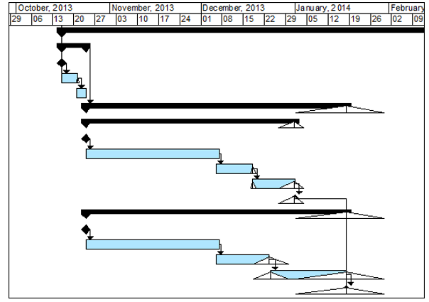
Traditional visualization techniques include bar charts or Gantt charts and various schedule network diagrams. Although the Gantt chart is named after Henry Laurence Gantt (1861 – 1919), an American mechanical engineer and management consultant, he was not the first person who invented it. In 1756, 18th-century British polymath Joseph Priestley published the “Chart of Biography”, where he plotted 2000 lifelines as bars on a time scale. He also created “A New of Chart of History” where he presented various historical events on a time scale. In 1896, Polish economist and engineer Karol Adamiecki created a method of ‘work harmonization’ that was based on a chart similar to the modern Gantt Charts. His “Harmonygraph” became a predecessor to modern Gantt charts. At the beginning of the 20th century charts, very similar to modern Gantt charts were starting to be used primarily in Germany. Henry Gantt developed his chart around the years 1910–1915. In the beginning, Gantt charts did not include any calculations; planners just estimated start, finish times, and durations of activities, and plotted them on a time scale. After the Critical Path Method was developed, Gantt charts were used to present the results of a schedule network analysis. Other visualization techniques of project schedule include various network diagrams, which are essentially flow charts that show relationships between activities. Gantt charts may present uncertainties in project schedules. For example, a triangle on a risk adjusted project schedule can show low and high durations of activities as a result of risk analysis.
Below is Gantt chart with uncertainties in task durations as a result of project risk analysis:

In project risk management, analytical models also include events, decisions, various conditions, and many other parameters. These types of business models can be very complex and should be visualized. Here are the key ideas behind many diagramming tools:
- Diagrams should be standardized. Everybody should have a common understanding of the elements. To support standardization, the diagrams should have a specification or set of rules that outlines how the diagram will appear and the meaning of each component
- Diagrams must be intuitive; not everybody will read the specification and not everybody will follow specification precisely: therefore, people who use these diagrams should find them easy to understand.
- Diagrams must be simple; if it takes too much time to create or interpret a diagram, the value of the diagram is diminished.
Visual Tools for Probabilistic Business Problems
Visual modeling tools are widely used to describe complex models in many industries. Here are few examples. Unified modeling language (UML) is actively used in the software design. Visual modeling languages are the next step above simple individual diagrams. They uses many diagrams that are related to each other. UML is also used to present sequences of activities, system states, and interactions between different components of a system. Essentially UML is intended to provide a standard way to visualize the design of a system. In particular, this visual modeling language approach was applied to defining relationships between different events.
Another solution for modeling complex business and technology projects is Object-process methodology (OPM). It is a bimodal visual and textual conceptual modeling language and an emerging ISO Standard (ISO- 19450 “Automation systems and integration — Object-Process Methodology”) for system modeling and design. OPM is an easy to use and understand set of standardized diagrams, which help to visualize complex systems in different industries including project management.
A number of diagrams are actively used in the field of decision and risk analysis and risk management. We already discussed some risk management visual tools, such as a risk matrix with different types of information presented on it, frequency histograms and cumulative probability plots which show the results of Monte Carlo simulation, and risk mitigation waterfall charts.
In addition, a number of diagrams are used for project decision analysis. Among them are decision trees, strategy tables, cause-and-effect diagrams, force-field diagrams, mind maps, and various flow charts. Some of them became valuable tools in project management and are included in the Project Management Body on Knowledge. All these diagrams are intended to simply our understanding of the system, which is in our case is projects with uncertainties. Visual modeling languages and diagrams are also applied to probabilistic business problems. Uncertainties associated with project variables, relationships between uncertain variables and result of analysis, as well as calculation algorithms can be displayed using these diagrams.

