

One of the challenges of project risk analysis is creating visualizations that provide the relevant information in a format that is easily understood by the intended audience. The Gantt chart is a useful format on which to base the results of schedule risks analysis.
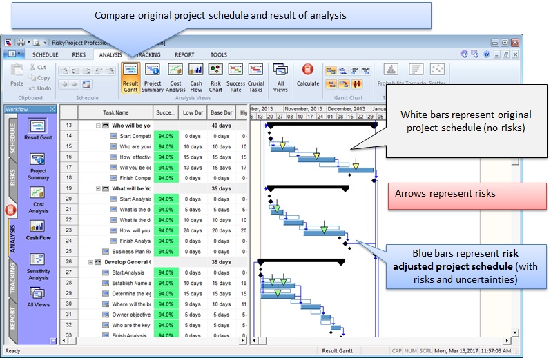
Gantt charts may be one of the most recognizable visualizations of project schedules. Developed in the early 1900’s by Henry Gantt, they were first used as a general planning tool for a variety of processes. However, it was not until the 1960s with the advent of critical path and adoption of computer based CPM scheduling tools, that Gantt chart became the primary visualization tool for schedule planning and analysis. We will show how this format can be modified to show the results of project risk analysis using a “risk adjusted” Results Gantt chart. Risk adjusted project schedule is generated based on results of project risk analysis of the original schedule. The Result Gantt chart provides alternative models of a project based upon the results of a Monte Carlo schedule risk analysis. The chart consists of two precedent networks that visualize the original deterministic schedule and the results of the Monte Carlo simulation. These results include both uncertainties in schedule parameters (start time, finish time, duration, lags, calendars) and risk events. Each activity has two bars for the deterministic and simulation results respectively. The bar for the simulation results can be modified to present additional information about the results of the schedule risk analysis. The length of the bar can be modified to represent various levels of uncertainty. Often the default value is P50 or Mean, but these values can be modified to show other levels such as P80, which is a standard level of certainty for calculating schedule margin.
In addition, the ranges and distributions for early and late start time and finish times for each task can be visualized as small triangles at the beginning and end of each bar, which provide a quick overview of the relative levels of schedule uncertainty in each task. You can visualize how risks events are assigned to project tasks using arrows. Arrows can represent threats or opportunities. Their direction, color, and size indicate if they are a threat (down) or opportunity (up), and severity or criticality (color and size). It is possible to link specific detailed risk assignment probabilities and impacts, such that it can be accessed directly from the individual arrows. The result is a rich and easy to understand Gantt chart that provides its audience a quick overview of the results of a project risk analysis in comparison with the original project plan. Event chain diagrams take the idea of a using the Gantt chart to model risk and uncertainties a step further. Event chain diagrams allow planners to identify events (risks) that affect specific activities and model both single events and chains of events (event chains) and identify the critical event chains that will have the most potential impact on the project. Chains occur with one event causes another event or chain to occur. The relationships and potential impact of these events can be extremely complex and because As Event Chain diagrams are based on a Gantt chart format, planners can provide team members and other stakeholder an easy to understand visualization that combines the information about risk model and the resultant analysis.
So if you are performing project risk analysis and are looking for ways to visualize the results of your analysis, consider using Result Gantt or Event Chain diagrams as they build upon the standard Gantt chart and will effectively communicate your results to your target audience.